ApplyPass: Auto Apply to Jobs with AI
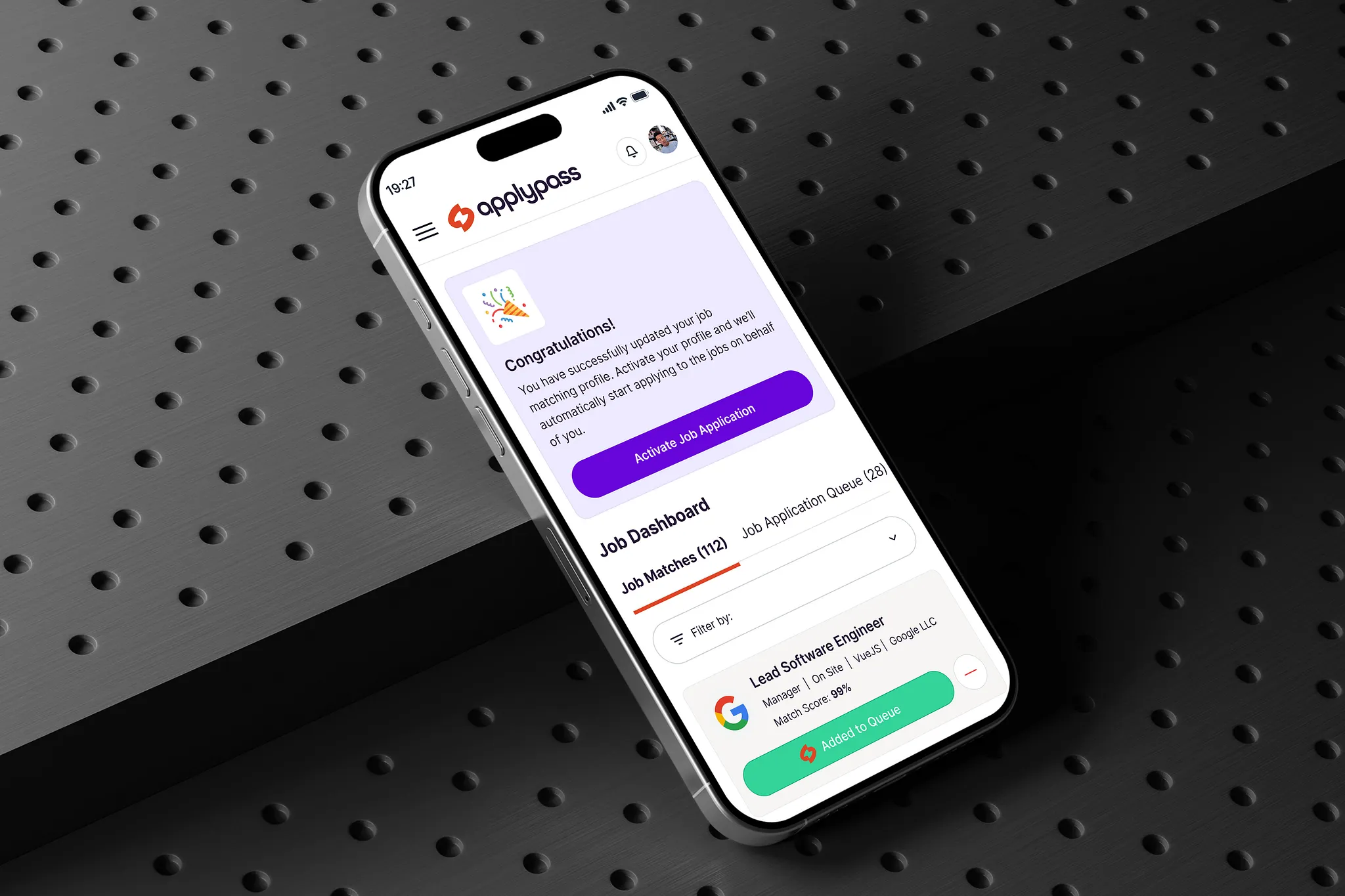
ApplyPass is a consumer SaaS portal that allows users to automatically apply to jobs using AI. Users can upload their resume and cover letter, and the platform will then apply to jobs on their behalf. The platform is designed to be user-friendly and engaging, with a focus on simplicity and ease of use.
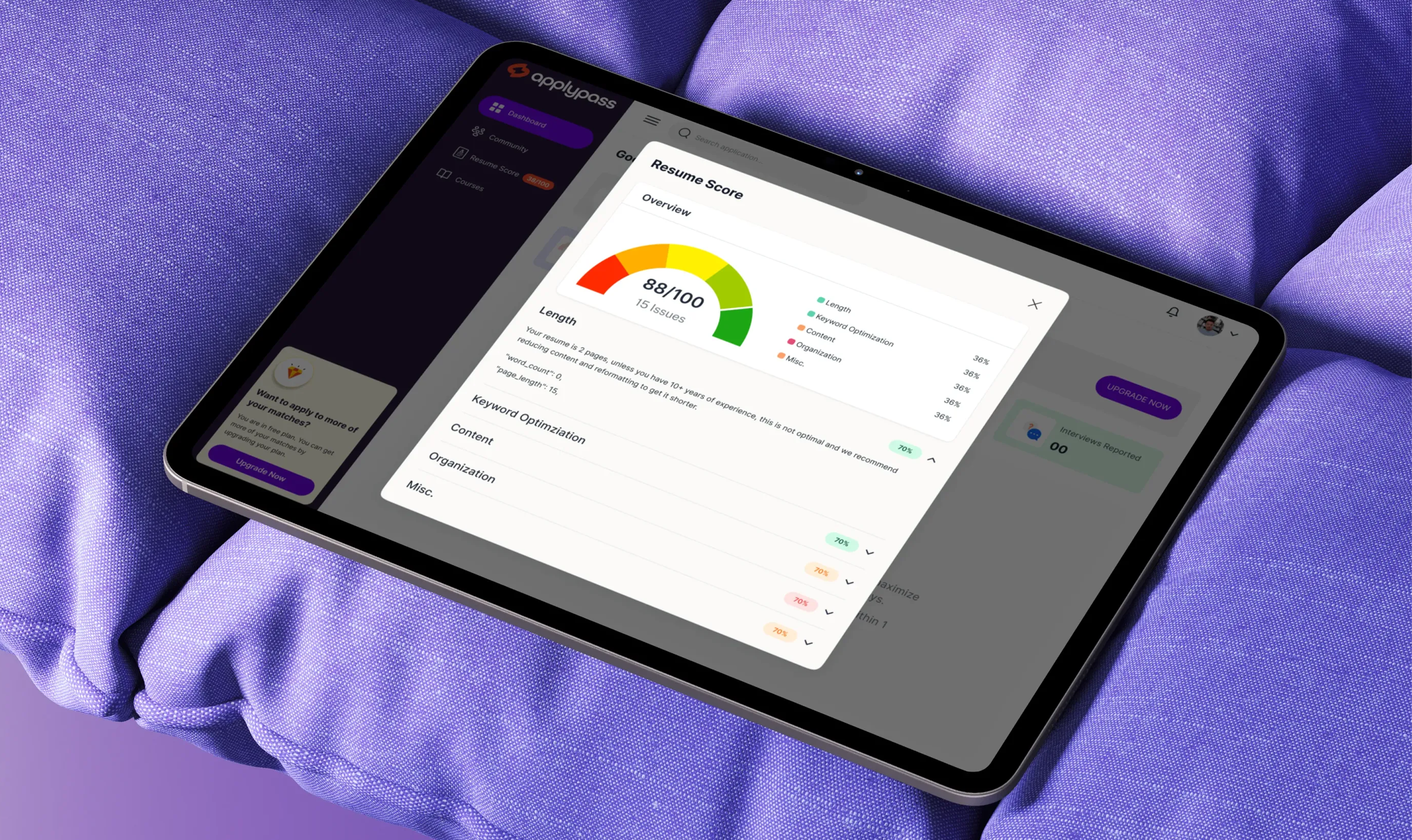
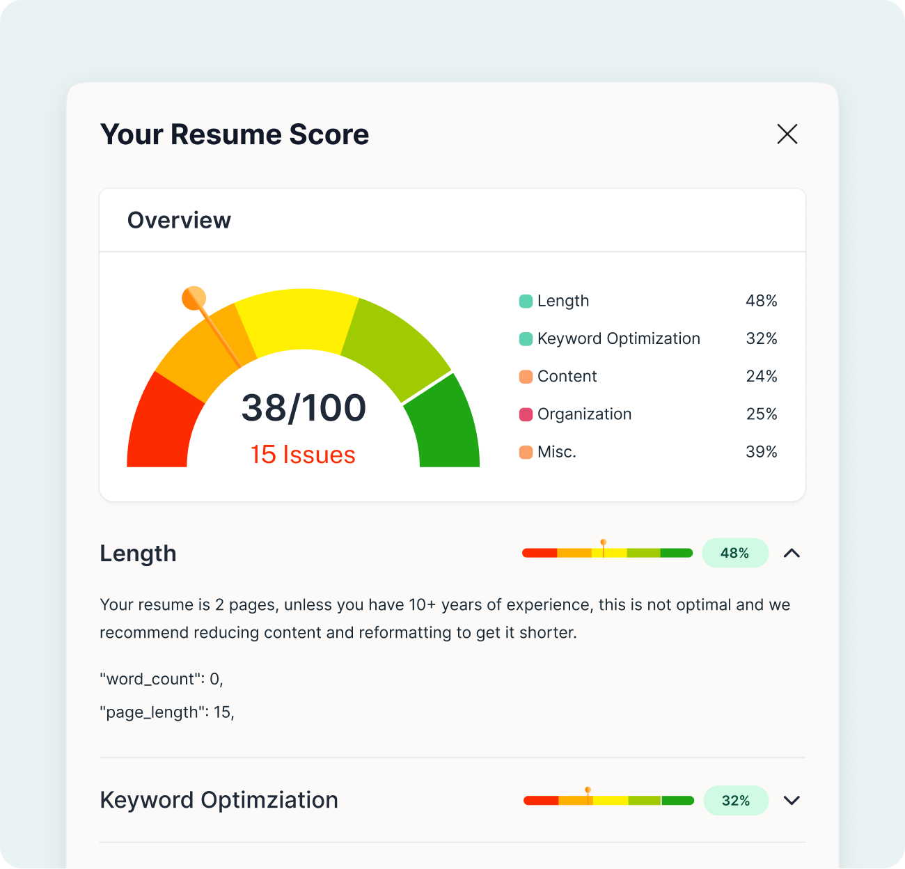
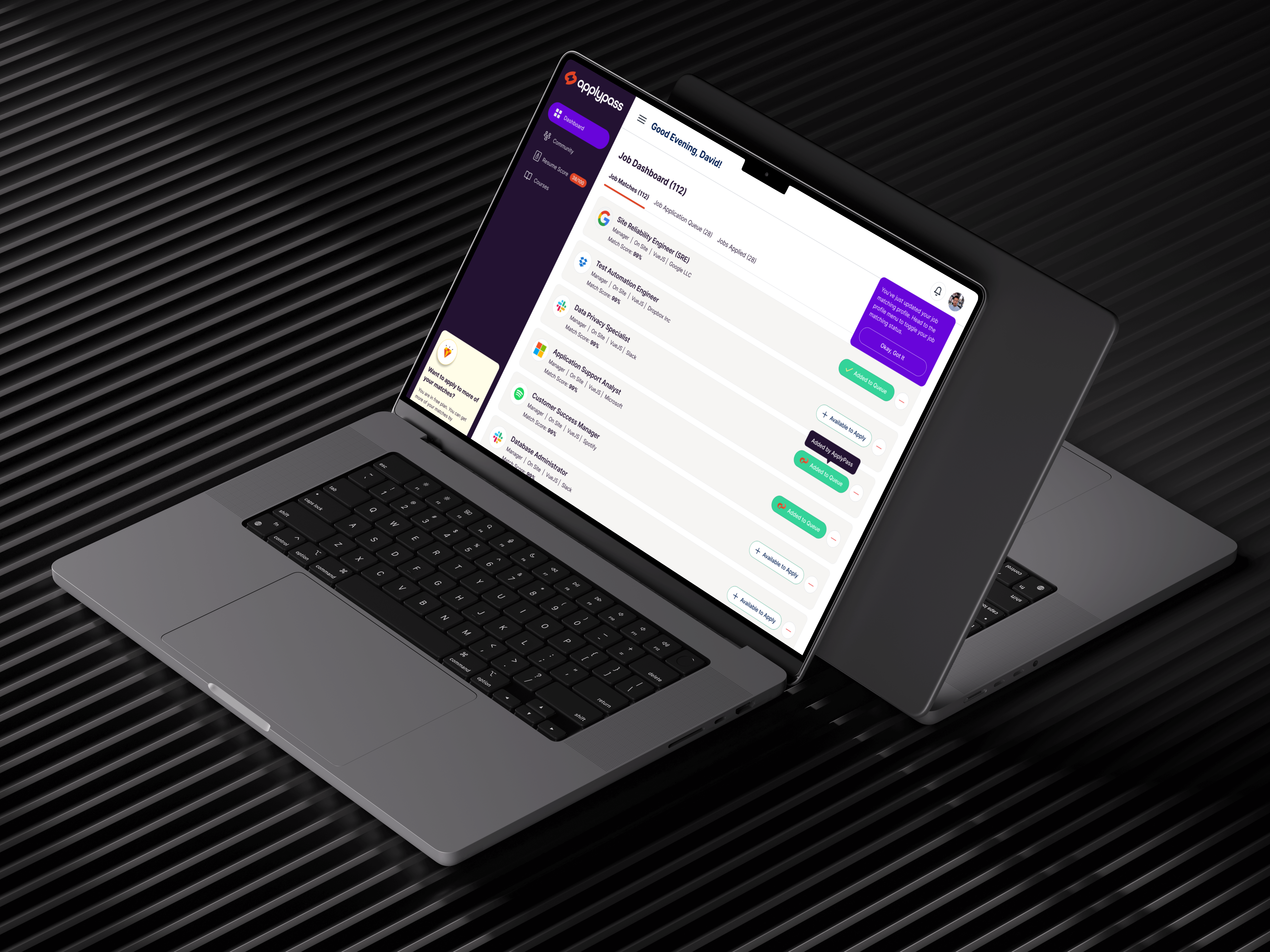
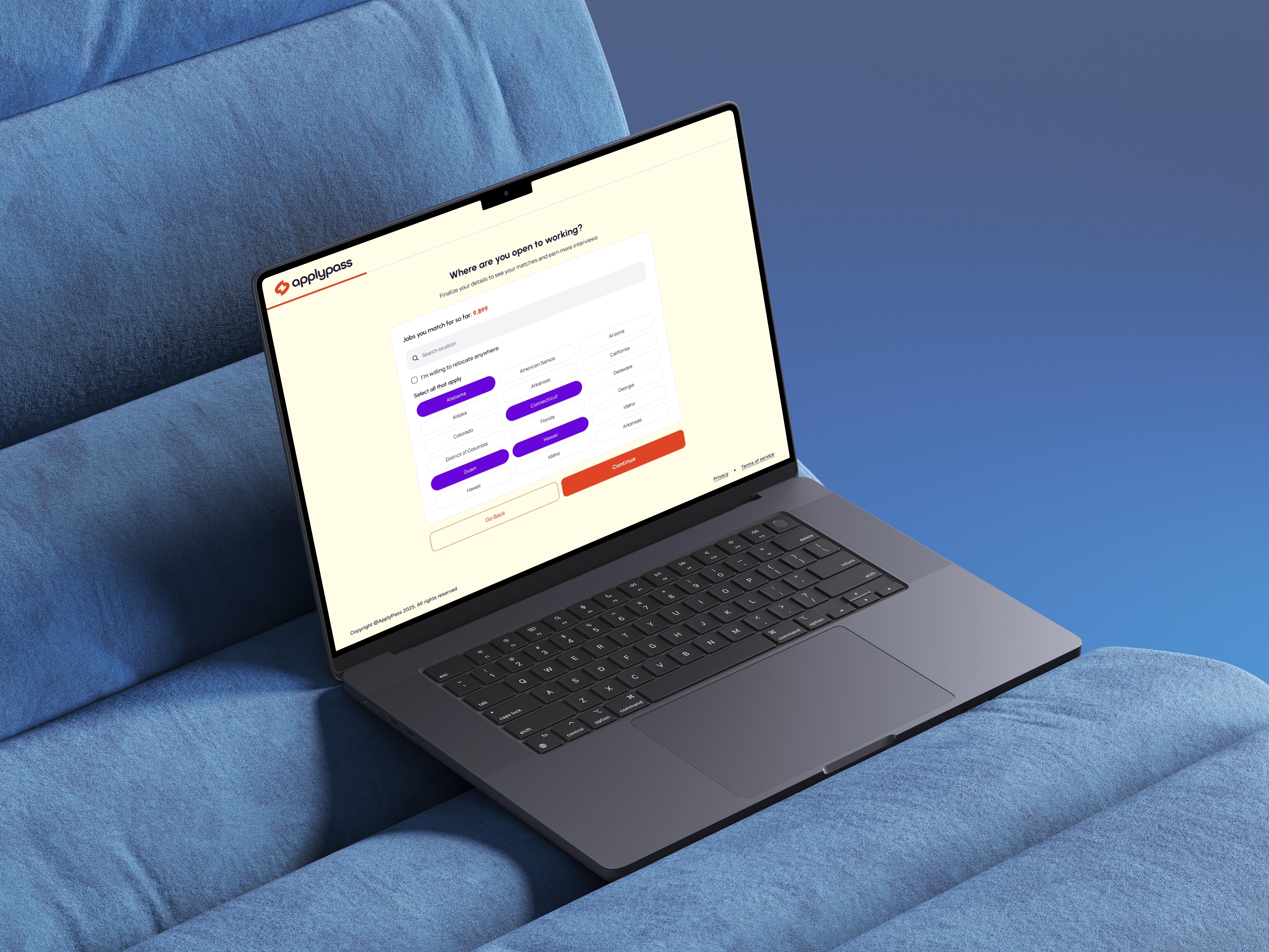
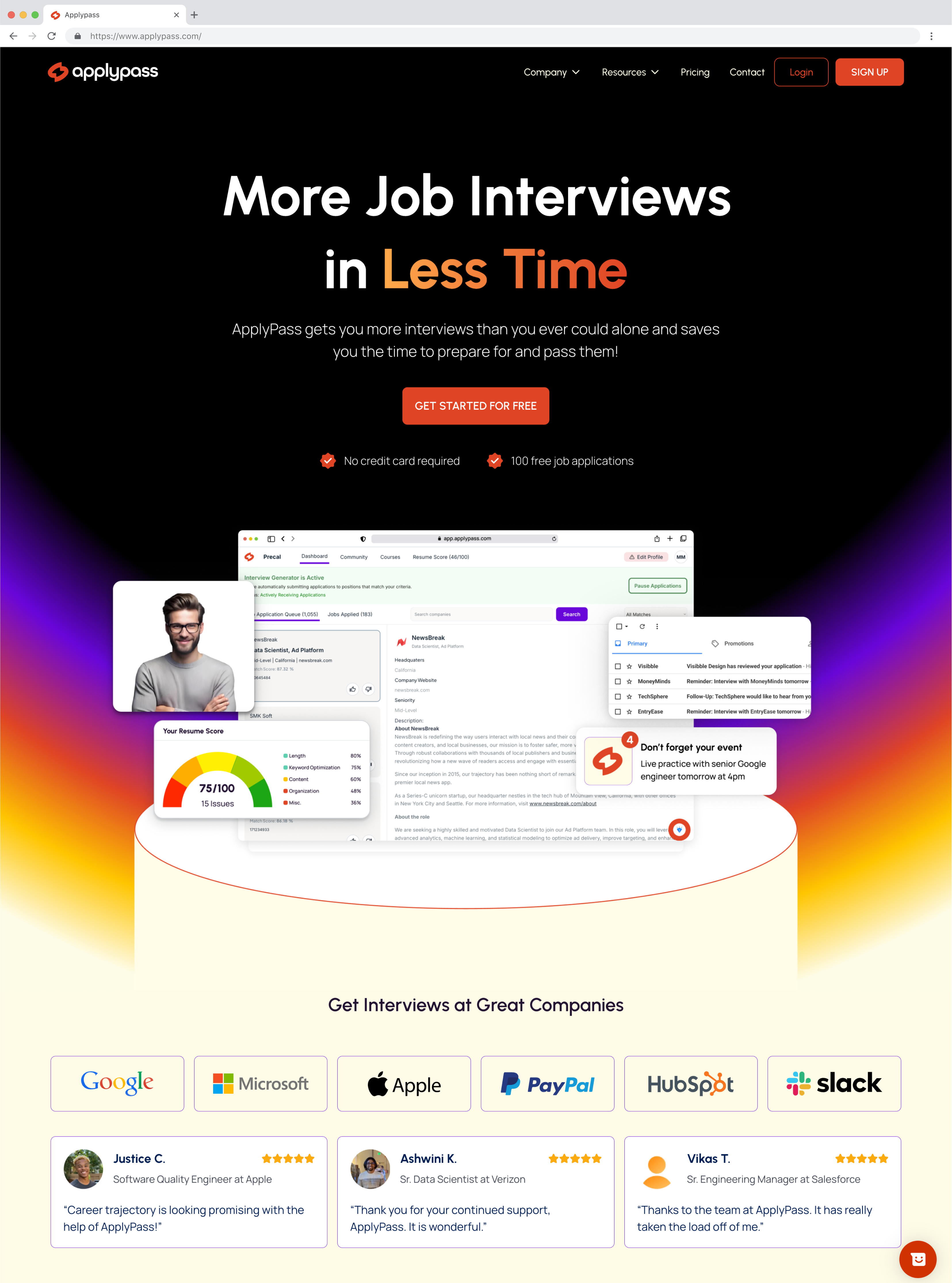
ApplyPass's recommendation engine uses AI/ML-based vector matching of your resume to live job descriptions. It retrains nightly based on your preferences, so your feed becomes sharper and more relevant each day. Users experience a 40% higher recruiter response rate. We have tested hundreds of resume variations to develop a formula that maximizes recruiter interest. Already getting interviews? Great! Your resume remains a key consideration for companies when they make an offer, so a stronger resume leads to stronger offers.
The Problem Space
The client wanted to redesign their consumer SaaS portal to make it more user-friendly and engaging. They wanted to create a more engaging and user-friendly experience for their users. Zendeeps was hired to redesign the consumer SaaS portal, build the marketing site in Webflow and create a new visual identity for the brand.
Our Design Approach
- Unified, Actionable Insights: The platform is designed to be user-friendly and engaging, with a focus on simplicity and ease of use.
- Proactive Intelligence: ApplyPass uses AI/ML-based vector matching of your resume to live job descriptions. It retrains nightly based on your preferences, so your feed becomes sharper and more relevant each day.
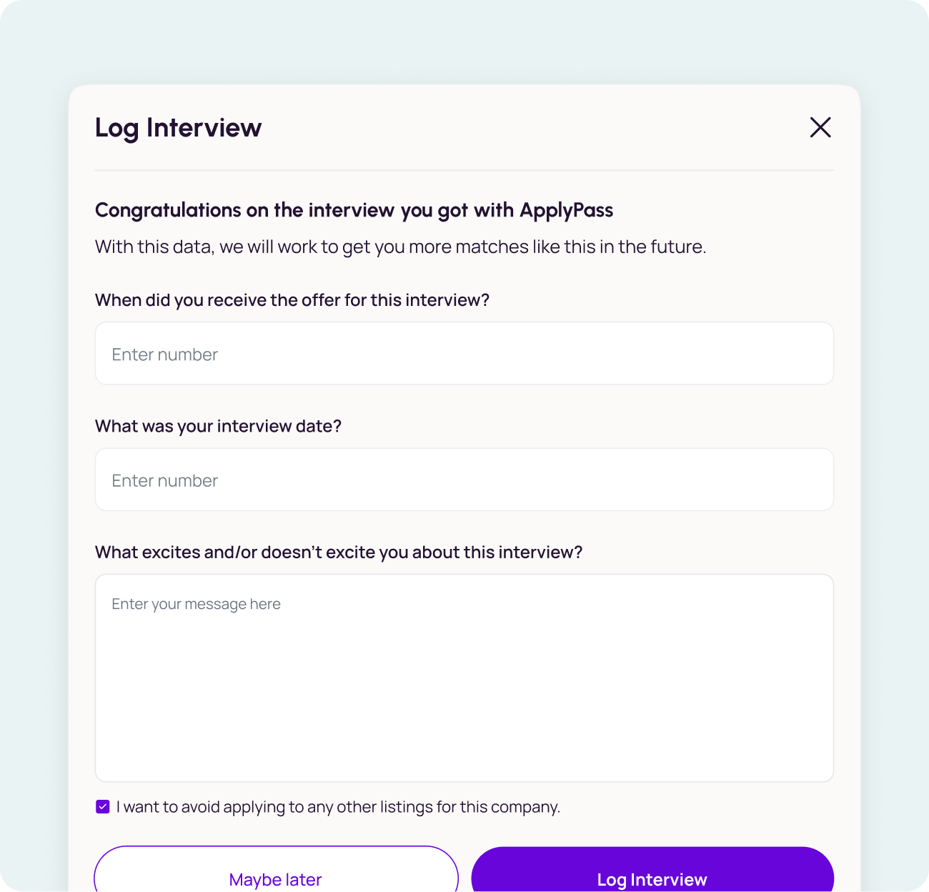
- Workflow Integration: ApplyPass integrates job application steps into a single, efficient flow—making it easier than ever to manage and streamline your job search activities.
- Fast Onboarding & Intuitive Experience: ApplyPass's recommendation engine uses AI/ML-based vector matching of your resume to live job descriptions. It retrains nightly based on your preferences, so your feed becomes sharper and more relevant each day.
- Collaboration at the Core: ApplyPass's recommendation engine uses AI/ML-based vector matching of your resume to live job descriptions. It retrains nightly based on your preferences, so your feed becomes sharper and more relevant each day.
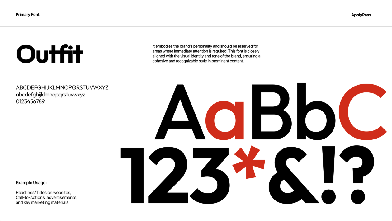
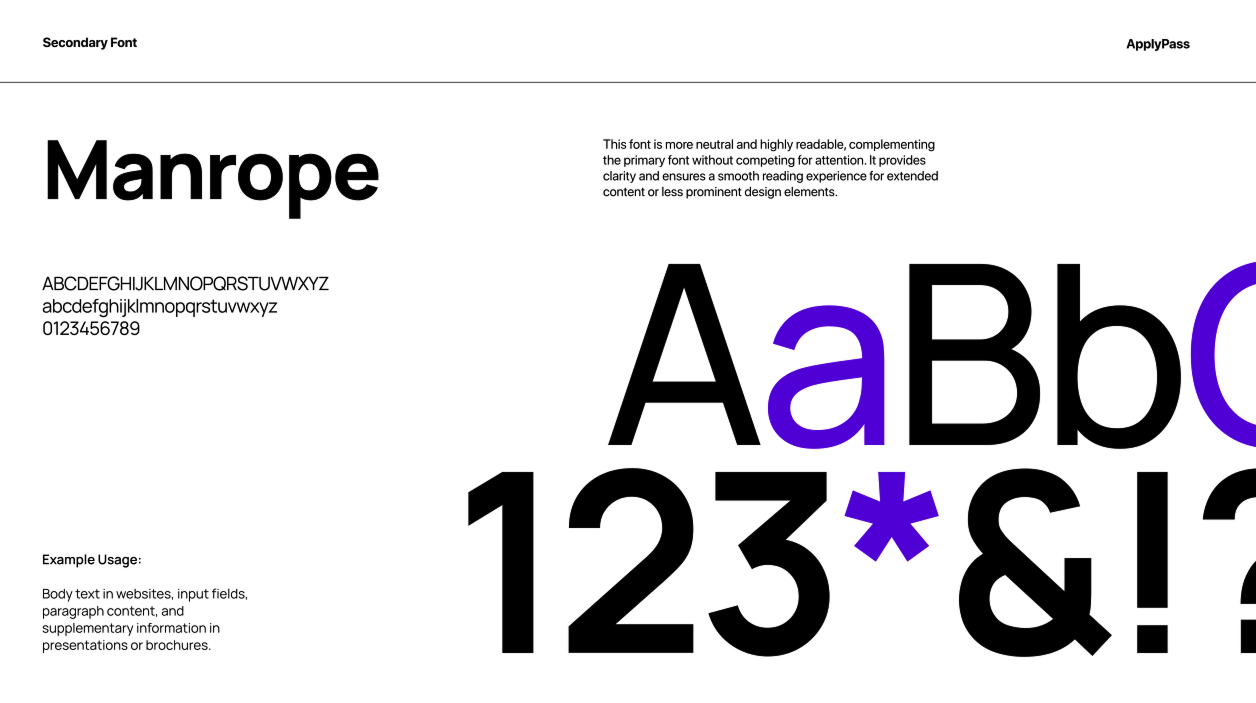
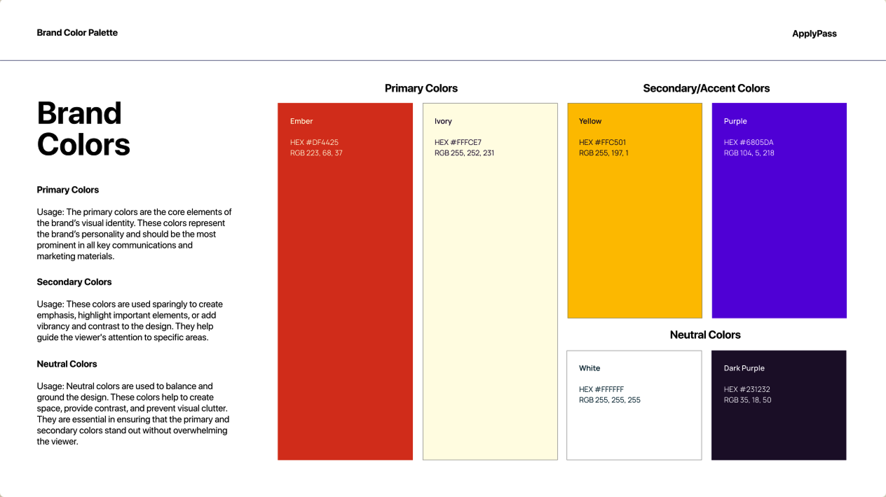
Design System & Visual Language
We developed an expansive, highly systematic design system engineered for both scalability and visual coherence. Every component, style, and interaction was meticulously documented to ensure rapid iteration, effortless team collaboration, and a consistently polished user experience across the entire MonuPi platform.
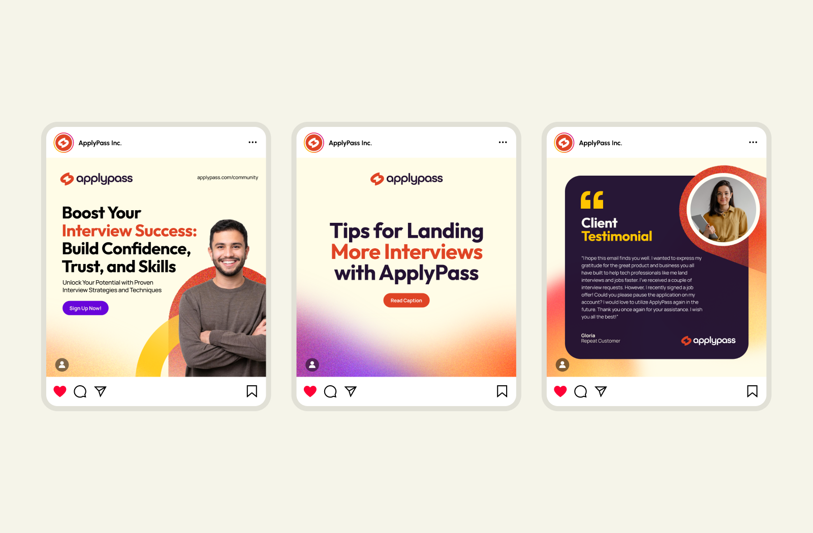
Final Designs
The final designs were a result of rigorous testing and refinement based on user feedback and performance metrics. The designs were optimized for speed, accuracy, and ease of use.
Interested in a similar transformation for your platform?
Let's discuss how Zendeeps can help you create intuitive, data-driven experiences that developers love to use.